How to Create Your Online Portfolio
Format is an all-in-one portfolio website builder with built-in tools like client galleries, SEO, an online store, and blogging.
Build your online portfolio in six simple steps with this easy-to-follow guide.
Choose your template.
The first choice you’ll make when setting up your online portfolio is how you want your template to look. No pressure, though—if you decide later that you don’t like the template you’ve picked, you can change things up whenever you like. It can be easy to get caught up procrastinating when you’re worried about everything looking perfect, so give yourself a break. Keep in mind that once you have your basic site set up, you’ll have lots of time to customize and change it up as much as you want. Pick a portfolio template you like to get started with and go from there.
When you start creating your Format site, you’ll have the option to choose between a few different types of template layouts:
Horizontal Scrolling
Fullscreen Slideshow
Thumbnails
Vertical Scrolling
Slideshow

Curate your work.
Deciding what work to include in your online portfolio can be a challenge. Start by curating just ten images that you know will make you stand out. In the future, you can create more galleries for portraits, landscapes, personal work, works in progress—whatever you feel like showcasing. But for now, just select ten of your best pieces.
Think of this as a highlight reel. When someone ends up on your site, you want them to get an accurate, positive impression of your work right away. Having a well-thought-out gallery to scroll through offers visitors a window into your work the moment they land on your page.
We know it can be overwhelming to try to distill a large (or small) body of work into just a few images, especially when you have an emotional attachment to your creative output. If you can, try looking at your work through the eyes of a prospective client or photo editor. What jumps out at you? It can also be helpful to select pieces you’ve received praise for in the past. Still not sure? Ask for a second opinion! Enlist a trusted friend or colleague and get their honest feedback.
Create your first gallery.
Once you’ve selected your first gallery images, just choose “Gallery” from the “Create New” tab and upload, adding captions if you choose. Well-written captions can be a good way to give context to your work, especially if you’re showcasing commissioned pieces or collaborations.
Some general guidelines and best practices for creating great galleries:
If you want to showcase multiple shots from a shoot or series, it’s a good idea to only include a maximum of three images from any one series.
Make sure your gallery is digestible and organized by keeping it under 20 images per collection. Instead of making your audience endlessly scroll, split your work up into multiple galleries.
Organize your online portfolio into tidy, cohesive collections. Don’t confuse your visitors with seemingly random work throughout your site. Look for common themes and use that to tie your narrative together.

Edit your menu.
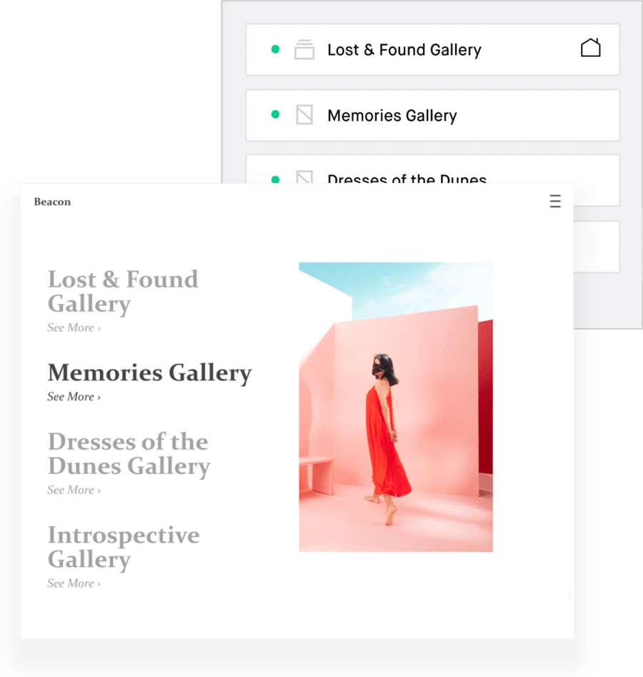
The site menu editor allows you to control and organize which pages are displayed in your menu, add items, and set the homepage for your site. It’s basically mission control for how visitors will navigate your online portfolio.
Consider how you want people to look at your work and organize your menu in a way that helps visitors to engage with your site and follow your story.
A neatly organized sidebar menu, for example, is a great way to give visitors easy access to multiple projects and collections.
When it comes to navigation, start simple. Having a clean, easy-to-find menu will add to your visitor’s experience. And remember, most people are browsing from their phones so it’s important to ensure that your portfolio website is responsive (a fancy way to say it’s optimized for mobile) and is easy to browse.
Many website builders, including Format, automatically optimize their templates for mobile viewing, but it’s still a good idea to review what your site looks like on your phone. Full-screen images look stunning on a monitor but may be too big on a phone.
A creative grid layout that you’ve customized for desktop browser viewing might look completely different on a small screen.
Check things like:
the way your menu functions
navigating around your site on a smaller screen
how your images feel on mobile.

Customize your site.
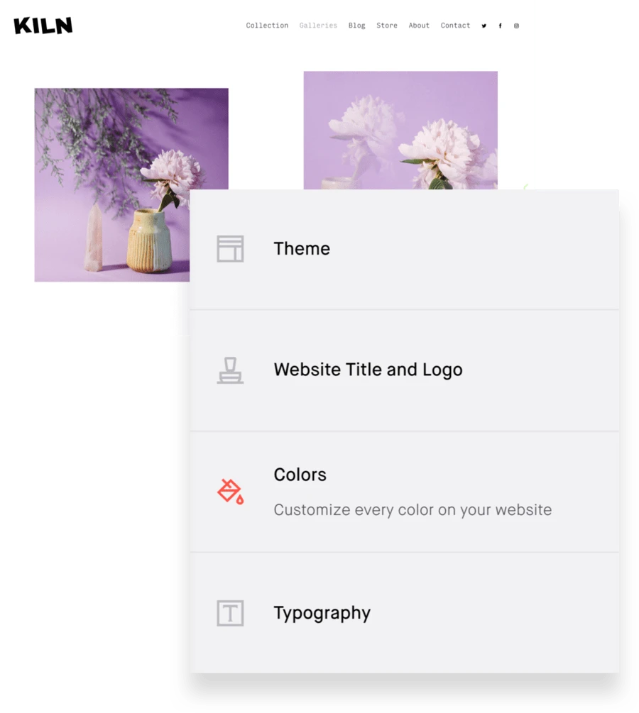
The “Design” tab of your dashboard is where you get to have fun and play around with how your online portfolio looks. Explore the different templates and presets, and then customize as much as your heart desires.
Under “General,” you can change the font and sizing of your website logo, or add an image if you have a custom logo you’d like to use. You can also edit the style of your site’s headlines, text, links, and footer, and change the background color. Choose one of the custom fonts for a quick way to give your portfolio some unique character.
Ensure your design reflects your personal brand. A few design questions to ask yourself:
What font(s) do you like? Do they match your brand/work?
What color palette goes with your selected work?
Do you have a logo? Do you need one?
Do you like a dark, light, or neutral preset? How do the different options change the look and feel of your online portfolio?

Make it easy for people to find you.
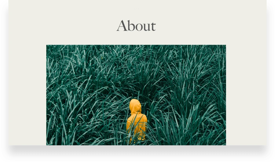
You’ve done a lot so far! You’ve curated your work, customized your templates, and created a menu that makes it easy for people to navigate around your site. Now it’s time to add contact info and an about section to your online portfolio so visitors know who you are and how to get in touch with you. This is a crucial step since the about page is the most-visited page for Format portfolios—don’t miss your chance to make a great impression.
This is where your biography, CV or resume, and contact information live. Including a headshot is nice but not mandatory. You could also add links to things like published work, press, and reviews here, or you could save that info for a different page.
Sometimes it’s hard to write about ourselves, so here are some prompts to help you nail your bio:
What are you currently working on?
What past work or projects are you proud of and why?
Where do your professional passions and interests lie?
What do you consider to be your biggest accomplishments, within the industry and in other areas of your life?
What do you want to do more of? What do you want to do less of?
Obviously, we don’t recommend listing what you don’t want to do in your bio, but taking stock in this manner is a good way to discover what you should include. A strong about page should give you a sense of the author, their focus, and their style. Aim for friendly rather than overly formal. It’s a conversation, not a resume.
Create Your About Page
Under “Create Page” in the “Pages” tab of your dashboard, select “Custom Pages” to find a selection of about page templates you can customize.
Since you’ve put so much work into your online portfolio, you want to make it easy for people to contact you. You have two options here: create a dedicated contact page or add a contact form right on your about page.
Either select your about page in the “Pages” tab of your dashboard and choose “Add Section” or create a new custom page and choose a contact form template.

Link to your social media accounts, add SEO, or set up your online store.
Now that you’ve created the bulk of your portfolio, you can take things even further by adding one (or more) of these extras. Think of your online portfolio as an ice cream sundae with your images and templates as the ice cream. Your about and contact page are hot fudge (or caramel if you prefer it). Everything else is a bonus topping. You can go crazy and add whipped cream, sprinkles, and a cherry!
Get social.
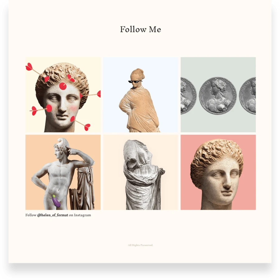
Under the “Social” tab of the Design tab, you’ll see the option to add up to five icons linking visitors to your social media accounts. If you have a professional (not personal) Facebook page for your creative business, or if you post work on Instagram or share updates on Twitter, linking to your social media is a great way to grow your professional brand online. It lets visitors get to know you better and see more frequent updates on what you’re currently doing.
It’s important not to add any accounts that you wouldn’t readily share with clients. If your Instagram is more focused on your personal life and you don’t share your creative work there, it’s better to leave it out. You may also want to consider creating separate Facebook, Twitter, and/or Instagram accounts for your creative work. Adding a link to your LinkedIn account can be helpful if you want to be able to network with others in your industry.
Get noticed.
SEO — search engine optimization — doesn’t need to be complicated. Help new clients find your online portfolio with simple tools that guide you through SEO every step of the way. You can edit and preview what people will see when they Google your site and make your portfolio as visible as possible. Select the “Settings” tab from your dashboard to edit your site’s overall SEO or select “Settings” from any page to edit that specific page’s SEO content.
You can also let people know exactly where to find you offline with a custom map. Share locations for your studio, a gallery show, upcoming events, restaurants, or any other place you can think of! Simply create a custom page, add a section, and customize your map with up to five locations and personalized labels.
Get sales.
Doing what you love is great, but getting paid to do what you love is even better. Your online store is included in every Format plan, and you keep 100% of your revenue. Think outside the box of just selling physical inventory—you can sell all kinds of products, prints, packages, Lightroom presets, and digital products as well as schedule client bookings or workshops. Setting up your store is as simple as turning it on and adding an item.
Creating your online portfolio is easy—especially with a website builder like Format. Now that you know exactly how to create one, what are you waiting for?
Updated on May 27, 2020 | By Steph Davidson