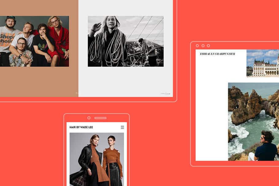
We’re always looking through the websites created by the Format community for fresh design inspiration. We recently released four brand new templates, and the results haven’t disappointed. People have already created some incredible websites using these new designs—from colorful, dynamic layouts to simple, classic online portfolios.
We decided to share a few of our favorite examples with you for a little boost of website inspiration. Here are the best new websites created using Format’s new Premium themes. These talented folks are also showcasing some stunning work on their portfolios too, so this list is a solid double serving of creative ideas.
Find out more about our new templates.
Nikita Chorny
Photographer Nikita Chorny shoots fashion editorials and events. His online portfolio showcases his photography in a horizontal scroll, with captions added to each image for added context.
www.nikita-chorny.format.com
Format theme: Coral
Chesco Perez
London-based photographer Chesco Perez immediately catches the viewer’s eye with the creative layout of his homepage, which utilizes lots of white space and colorful, dynamic transitions between pages.
www.chescoperez.com
Format theme: Meander
Jim Ryce
Travel and portrait photographer Jim Ryce is based in Toronto, but his portfolio showcases work shot in a range of locations, from Argentina to Texas. A classic font and simple layout on his website lets the lush scenery of Ryce’s photos take center stage.
www.jimrycephoto.com
Format theme: Coral
Catherine White
Art director, designer, and filmmaker Catherine White currently resides is Montreal, where she works on a range of creative projects. Her portfolio reflects the multidimensional nature of her work, with a homepage that shows previews of different projects. A modern font and bold red color scheme add personality to her website.
www.catherine-white.com
Format theme: Iris
Megan Mack
Photographer Megan Mack shows off celebrity portraits and editorial shots with a clean, vertically scrolling layout. Her website makes use of ample white space for a simple and classic feel.
www.meganmack.com
Format theme: Iris
Thibault Charpentier
Travel and lifestyle photographer Thibault Charpentier divides his portfolio into galleries organized by location and subject. Whether shooting in Lebanon, Japan, or Marrakech, Charpentier’s photos are always crisp and neatly composed. Separate website sections for tearsheets and interior photography keep his website organized.
www.thibaultcharpentier.com
Format theme: Iris
Wade Lee
Stylist Wade Lee has worked on hair for an impressive range of clients, including Nike, Maybelline, Macy’s, and Sephora. His website showcases his portfolio in detail, with a number of galleries highlighting different work. A grid-based homepage layout gives a quick first impression of Lee’s background.
www.hairbywadelee.com
Format theme: Iris
Rozette Rago
LA-based photographer Rozette Rago uses a typewriter font across her whole site for a playful feeling. Her whole portfolio is carefully color-coordinated, with orange-accented links and a changing page background which complements her images.
www.rozette.org
Format theme: Coral
Hans Millett
The homepage of Hans Millett’s website offers a preview of his work via a fullscreen image and a short bio, quickly introducing the photographer to viewers. Millett’s images are displayed in a tidy vertical scroll, formatted at a large size which fills the whole screen.
www.hansmillettphoto.com
Format theme: Iris
Want even more portfolio inspiration? We’ve made quite a few lists of our favorite creative websites built using Format. Take a peek.
